ROLE
Lead Designer
BRIEF
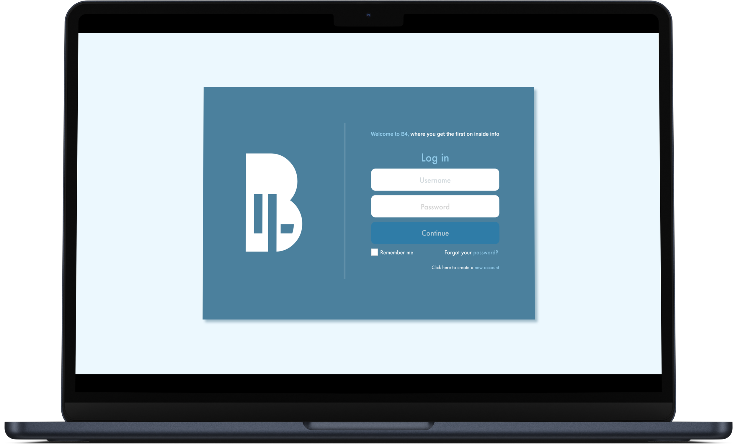
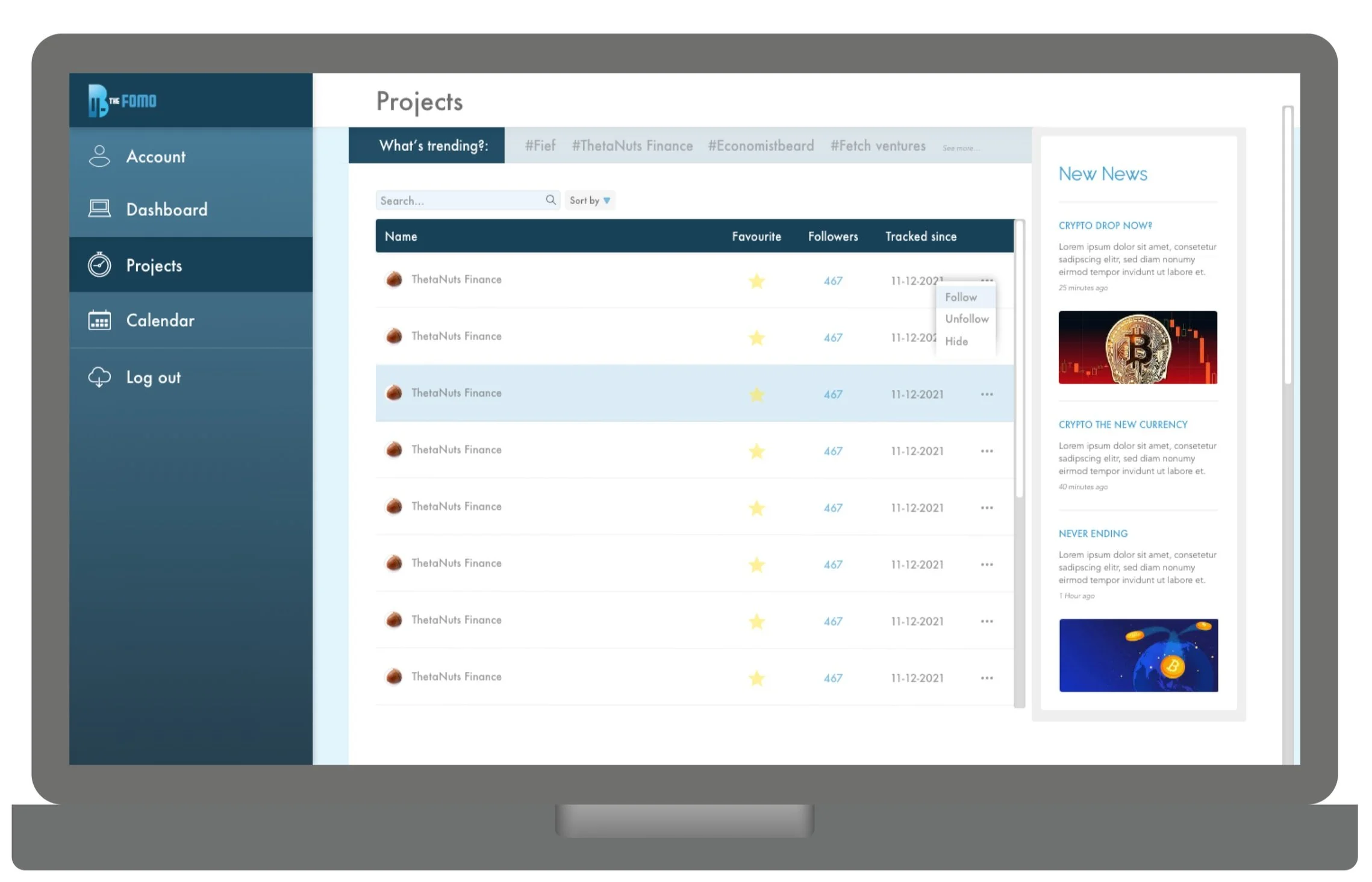
Design a logo for B4 the fomo and a desktop/mobile app, that has space for it’s user to communicate with others on the app and to find information about present and future Crypto currencies with ease.
SUMMARY
Before the FOMO is an app that provides pivotal information about crypto news at critical moments, allowing its users to be the first in the know, getting an upper hand in crypto currencies. Understanding what and when to sell, when to buy and when to act.
The main focus of this desktop/mobile app, is to present a vast amount of information clearly, while also developing a thriving community for users to connect and learn from one another.
Potential challenges were, preventing the user from being overwhelmed by the amount of information being shared, how to keep up with news they really wanted to see and not be bombarded with unnecessary information, how to connect and converse with other users.
Step One: UX
RESEARCH
In researching popular crypto selling sites, (Binance, Kucoin, cryoptonews) I asked questions that helped inform my own thinking.
I gained a comprehensive understanding of the user experience through this research, predominantly understood how to present a vast amount information clearly. I identified opportunities to improve what i’d envisioned, ensuring the design was both user-centered and effective. I was influenced heavily by Cryptonews, who displayed a variety of techniques when presenting infiormation. Our target audience revolved around, Tech-Savvy Millennials and Gen Z, those new to crypto currency that were eager to learn, Investors and Financial Professionals.
DEFINING THE FLOW
USER INPUT
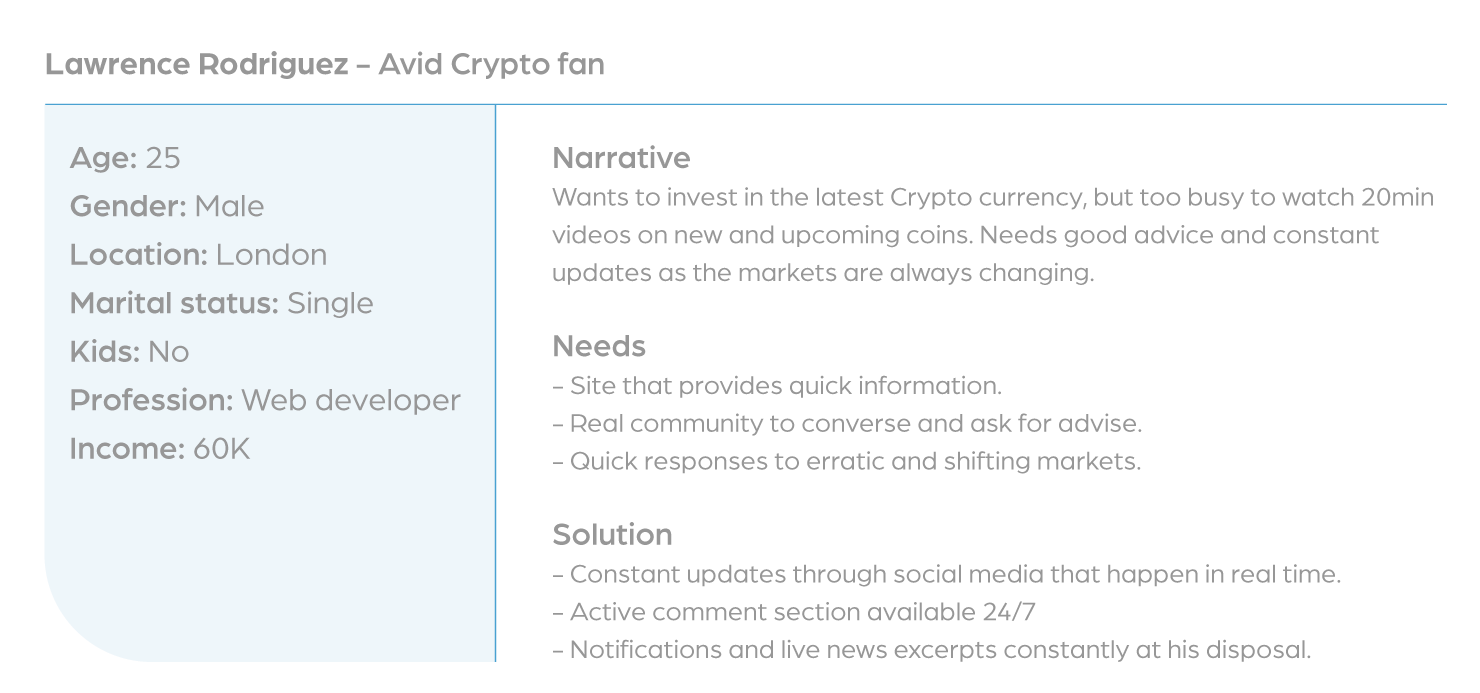
My client was an avid Crypto coin investor and had a community of Crypto investors. We were able to send out questionnaires and receive quality feedback, using this information I picked common themes, quotes and also developed multiple user personas to define what users desired. Here was what one looked like.
“I want an app that clearly shows new and up to date info. It needs to be simple to use.”
WIREFRAMES
Step Two: Logo & UI
logo research consisted of looking at Crypto-currency logos e.g Dogecoin and Ethereum.
PHASE ONE
PHASE TWO
FINAL
Green: attributes to MONEY, NEW, GROWTH, YOUTHFUL, VIBRANT.
Blue: Hope in new endeavours, clear skies.
TIMELINE
Three Weeks
TOOLS USED
Adobe Suite, Figma


